Textual analysis of print media products: Midsommar theatrical poster (2019)
Explore how codes and conventions are used to construct meaning in the theatrical poster for the film Midsommar (2019)
Why unconventional? Directors might feel that audiences have become bored with the conventions of the Horror film genre, and seek to offer them something different. This is for purely financial reasons, as it allows the producer to potentially target new audiences. This conforms to Steve Neale's genre theory. Films must strike a balance between repetition and difference.
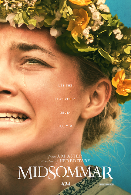
The white serif font implies a sense of purity, goodness and sophistication. This reinforces that this film is in stark juxtaposition to pre-existing films within the horror genre, and may appeal to an older more sophisticated horror audience.
- The poster is immediately unconventional due to its colour palette choice. It's lack thereof conventional horror poster elements such as black or red.
- The colourful, brightly lit image and aesthetic of the piece stands in stark binary opposition to the dark and dreary conventional horror poster. This reinforces to the viewer that the contents of this film will catch them off guard.
- Contradictory colours used are not the stereotypical colours of a horror film (blacks, dark blues, reds etc.), but the image of the crying girl tells the audience that something is wrong in the image/film - the bright colours cannot hide her fear. A clear binary opposition between the symbolically happy blue background, and the symbolically miserable crying woman. Once more, this functions as a proairetic code, suggesting violence and bloodshed ahead.
- The representation of women --> the woman on the poster is hegemonically attractive, and arguably this is a stereotypical representation of women as often women are portrayed as very emotional, however, the expression on her face surpasses just unnecessary emotion, and it comes across as one of extreme trauma. It is not just a 'dainty' tear rolling down the side of her face as we see in most depictions of women crying, but instead, her mouth is open and pulled down, her eyes are scrunched and tearful and her brows are furrowed, implying extreme emotion. This is a highly unconventional representation of women.
- a hermeneutic code is used in the hegemonically attractive woman crying, which reminds us of the damsel in distress, a common conventional trope of the horror genre. The symbolic code used in the costume of the flower crown she is wearing adds to this, giving her a hyper-feminine image.
- Vignette around the image, going from a dark colour surrounding the edges to a slightly warm light outlining Florence Pugh. The light, coupled with the wreath headband has religious connotations (mainly Pagan religions), which are often tropes of horror films.
- The A24 logo may resonate with the producer's niche fandom (Henry Jenkins), with the studio having been known to produce and distribute unique indie/ lower budget horror films to great success in past.
- The main image is a close-up shot of a woman crying, which is a conventional hermeneutic code of the horror genre as it creates tension for the audience and makes them ask questions. This is anchored by the tagline "let the festivities begin", which further builds tension as the binary opposition between the innocuous phrase compared to the distressing image makes it more sinister.
- Text displays the lexis 'let the festivities begin' a seemingly non-threatening and positive phrase, this is anchored through the bright and cheerful colour scheme and warm high-key lighting. However the facial expression the woman makes her look distraught and in pain, providing binary-opposition and making the overall tone of the poster sinister.


Comments
Post a Comment