Advertisement Analysis 🤔
Advertisement Analysis:
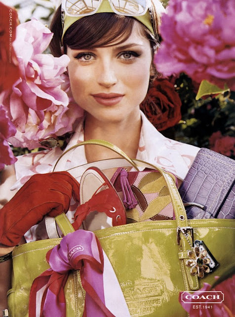
- The vast majority of the image seen above is composed with many hues of pinks, violets, and reds- each of these colours having their own respective messages, the pinks representing the clear femininity and calmness of the brand while the purple throws in a feel of royalty or wealth, finally the deep reds provide excitement and youthfulness. - All of these colours tossed in together just work to provide to target audience with a feel good emotion upon viewing it.
- Rather than a product, the ad seems to be attempting to captivate it's audience of what I can assume is probably housewives, middle age women maybe around their late twenties, early thirties, based upon the model's appearance.
- The decision to have the model wearing such a hefty amount of make-up alongside a 1950's reminiscent hairdo also holds implications of femininity, and works to give the viewer a good idea as to the type of brand that Coach is and their ideal customers, meanwhile placing sunglasses upon her head leads the mind to think about the warmth and enjoyment of Summer and good weather, providing a link between such and the coach brand alongside the prominent yellow headband and handbag.
- Noticeably, the lighting in the photograph is very bright and powerful, to give the piece a more happy feeling rather than having much dim lighting. - This helps promote that Coach is an optimistic brand devoid of negativity, it also presents to the viewer that perhaps their life would be much like such.
- The font used for the logo is very bold and formal looking though at the same time simplistic due to it's white colouring, paired with the tagline of 'Est. 1941' it makes the brand seem somewhat classic with the image of the women who looks dressed from a vintage period such as the 40s/50s as the central focus point, it emphasises to the viewer that Coach is a company that sticks to it's roots in a sense, its traditional.
- Though the background is somewhat drowned out, it is still prominent with very little negative space in the ad- it's all jam packed with colour, not any breathing space.
- Another key element here in the piece is that the model is looking directly at the camera, this makes the advertisement feel directed at the viewer and so makes it seem somewhat more personal, Coach is waiting on YOU not just anybody.
- With such a large focus upon flowers, the advertisement gets given the undertone of innocence, having that clear association with such, not really tainted with anything negative or bad.


Comments
Post a Comment