Analysing Teaser Posters (Kong vs Godzilla)

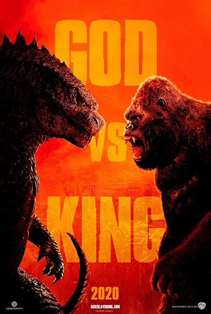
This teaser poster borrows the visual conventions of a WWE/ Grudge Match advertisement to immediately reinforce the idea that this is the form of conflict that the viewer can expect from the film. The composition centralises its typography, whilst positioning its lead characters with near to equal thirds of the frame at the sides, an example of the rule of thirds at play simultaneously drawing as much attention as possible to all three. The side profile midshot photograph of the film's leads within full focus emphasises the conflict between the two, as I mentioned, this paired alongside the proairetic code of their alert stances. (Godzilla's open claw, and Kong's agape mouth.) clearly emphasises that they are on the precipice of a fight. The bold, capital lettered sans serif font, indicates that this is modern and fresh, arguably encoded to be reminiscent of newspaper headlines. Reinforcing this film as an unmissable event. The bright colour palette of oranges and reds conn...
