Analysing Teaser Posters (Kong vs Godzilla)
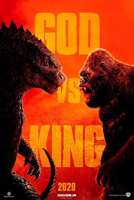
This teaser poster borrows the visual conventions of a WWE/ Grudge Match advertisement to immediately reinforce the idea that this is the form of conflict that the viewer can expect from the film.
The composition centralises its typography, whilst positioning its lead characters with near to equal thirds of the frame at the sides, an example of the rule of thirds at play simultaneously drawing as much attention as possible to all three.
The side profile midshot photograph of the film's leads within full focus emphasises the conflict between the two, as I mentioned, this paired alongside the proairetic code of their alert stances. (Godzilla's open claw, and Kong's agape mouth.) clearly emphasises that they are on the precipice of a fight.
The bold, capital lettered sans serif font, indicates that this is modern and fresh, arguably encoded to be reminiscent of newspaper headlines. Reinforcing this film as an unmissable event.
The bright colour palette of oranges and reds connotate a semantic field of fire, rage, and unbridled energy juxtaposed with the near-black of the two titular characters, constructing them as powerful and strong.
The lack thereof a clear background setting reinforces that our focus should entirely be upon the conflict of the characters in the foreground, as opposed to anything else.
The Legendary and Warner Brothers logos are kept tiny in white at the very bottom of the poster in either corner. Not at all imploring the viewer to pay attention to them. The image and slogan are the main attraction.
'GOD VS KING' immediately stands as a confident tagline, per its intertextuality of not mentioning the full names of Godzilla or King Kong. You already /know/ who these characters are. More clearly, it holds lexis of authority and prestige, acting as a hermeneutic code to pose the question of 'who would win?' when both are pitted together.
The inclusion of '2020' rather than any particular date is a convention that about every teaser poster follows. In the case of a film needing to be pushed back. (which of course Kong v. Godzilla was by a full year..)
All of the above points I've mentioned, all work together to establish themes of conflict at the core of the narrative to this film, everything from the composition to the mise-en-scene, lexis and choice in font reinforces this.

Comments
Post a Comment